

SOUL BASE
Day Goods : Discovering Day Goods: Where Minimalism Meets Vibrancy
BY: Annika Bielig-Bussmann
Nestled amidst the vibrant streets of Portland lies Day Goods—a shop where minimalist design intertwines with bursts of color, creating an immersive retail experience like no other. Led by Lara White and her partner, Jason Stamp, Day Goods is more than just a store; it's a carefully curated space where every element is thoughtfully selected to evoke a sense of wonder and invitation.
From handcrafted furniture to artisanal home goods, each item tells a story—a testament to Lara and Jason’s commitment to craftsmanship and authenticity. At the heart of Day Goods lies its pièce de résistance: a customized seating area that invites shoppers to sit, unwind, and immerse themselves in the beauty of the space.
Whether you're browsing the shelves or taking a moment to pause in the beautiful space, Day Goods is a place where style meets functionality with effortless grace, offering a welcome respite from the hustle and bustle of everyday life.
Design plays a crucial role in creating unique retail experiences. How did you approach curating your store's aesthetic to resonate with your target audience while staying true to your brand's vision? When was the idea born to create a retail brick and mortar with Day Goods?
Our guiding question when thinking about what to curate the shop with is, “What would we put in our projects and/or what would we want in our personal home / lives?”
We have always tossed around the idea of having some sort of showroom. We have a background in designing and building furniture, and after we graduated school, we thought that might be the direction we would go; however once we got into designing houses, that took over the majority of our time.
As we have started getting bigger custom homes, we have had more clients that desire custom furniture pieces, which has reignited the desire to design and build furniture again. The shop allows us an avenue to bring some of those pieces
directly to the market and keep a space for us to continue to explore our love for furniture.
As a design concept store, you likely encounter a variety of color palettes and elements. How do you incorporate diverse colors and elements into your store's displays and interior design to evoke certain emotions or themes? What is your favorite color palette and why?
We knew we wanted the shop to feel like a backdrop to the beautiful and diverse objects we would bring into space. This meant we would need to keep the palette very neutral. We decided to go with a light maple wood and paint the rest of the space white to have a more gallery feel. However we didn't want the space to feel too stark and flat; this is where the texture and curves come in.
Our favorite palettes are layered neutrals with moments of color, often colors that are in the surrounding landscape. In forested areas we will bring in more greens, desert more reds and browns and plains more blues and gold tones. We love to set up a guide, but then we also love to find those perfect moments to break the rules and have some fun.
In a world saturated with mass-produced goods, how do you source and select your items?
Fortunately Portland already has an ethos that lends itself to an abundance of incredible artists and makers, so we of course tap into that. We knew we didn't just want to do “local;” that’s already done very well by so many shops in Portland,so we wanted to bring in brands that we have used over the years when styling our projects and take the opportunity to branch out and find great new makers in places like Portugal, Canada, Australia and other cities throughout the U.S.
Retail spaces often serve as a canvas for storytelling. How do you use elements of storytelling within your store's layout and design to engage customers and create memorable experiences?
I think our story was creating a space that has elements of feeling like a home. A retail store by no means needs a little “living room area,” and you
can argue this takes away real estate for more goods; regardless, we created the little curved seating area where people can come in and take
a seat while looking at the art or flipping through one of the books to help showcase our design side and make the shop feel more cozy.
Sustainability is becoming increasingly important in the design and retail industries. How does Day Goods prioritize sustainability in its product selection and store design, and how do you communicate this commitment to your customers?
Sustainability is something that we always try to keep in mind. For example, one of the candle companies we carry can be reused as a cup after the candle is fully used up. You can also buy the same cups empty to complete the full set. We love products that can be reused or used for multiple purposes. We try to select products that are made from sustainable materials, like the toy cars we carry. They are made from wood as opposed to plastic.
One of the key elements to sustainability is the quality and longevity of the product. We want to provide well designed and well made products that someone can enjoy forever and hopefully pass down to the next generation.
With the rise of online shopping, physical retail spaces must offer something unique and immersive to attract customers. How do you create an environment in your store that encourages exploration, interaction and a sense of community among visitors?
Our approach has been to create a space that feels unique to shoppers by coming at it from an interior design perspective, making it feel more like a home while also giving a backdrop for the product. This may be to our detriment, but we try to not overfill the space and allow the furniture and art to breathe.
As we approach summer, many retail stores embrace seasonal themes or refresh their displays. What is your vision for Day Goods this summer? Are there any exciting changes or new elements that customers can look forward to experiencing?
Currently we don't have any specific seasonal changes planned; however, our store is always evolving with new art, furniture or goods. I would say there is something new every few weeks, but it's a very fluid evolution.

oregon home
COLORFUL PAST
BY: Emily Grosvenor
When Rebecca Van Sickle and Fergus Caldicott moved into a historic home in Northwest Portland in October 2014, they knew that it would need some major adjustments. Previous owners had made some cosmetic updates throughout the years, but no one had changed the awkward transitions between spaces, added to the number of bathrooms (two at the time) or grappled with the problem of doors hitting other doors. Plus, there was the matter of color — how to use it well to make the home feel modern while honoring its history.
“Overall, the flow felt off,” says Van Sickle. “We lived with some of the spaces longer than we expected.”
Large families demand a different level of functionality, but making it happen can be a cumbersome task. So the couple embarked on a multiyear, multiphase project with designer Lara White of Workaday Design to bring the historic property into the present while keeping the charms of yesteryear. And what charms there were: stained glass, south-facing windows, high ceilings, architectural details and brass door hinges that had “XOXO” stamped in them.
The first space they tackled with the designer was the basement, formerly just a white-brick storage space with cement floors. They envisioned this lower level for Caldicott’s wine collection and Van Sickle’s home office.
“They are total bosses — so this space was so important,” White says.
At the same time, they tackled the outdoor spaces, which benefited from a larger-than-average backyard for the area. But the project truly found its aesthetic voice with the plan for the mudroom, which was repositioned for a more accommodating entrance.
The collaborators chose local Portland maker Lonesome Pictopia’s “Solomon’s Seal” wallpaper for the mudroom and, with it, a dark gray-blue that would be used throughout the rest of the home. They loved the paper featuring the Pacific Northwest flowering native that grows in shade, which Van Sickle also grows in her garden.
“There is still a lot of light in that room, so it never feels dark,” Van Sickle says.
The pattern for the mudroom floor tiles was based on a larger-scale slate flooring from Van Sickle’s house in Ohio, which had been designed by her grandfather. Van Sickle had found photos of the slate floor and re-created the pattern in PowerPoint, and then a tiler painstakingly cut every tile and laid it to match the design.
The family moved out of the home temporarily for the next part of the project: the home’s kitchen, which traded space with a formal dining room. White added a large-scale island with a brass toe kick. There, Caldicott cooks dinner most days and the entire family bakes on the weekends.
“Everyone is always in the kitchen,” Van Sickle says. “We shrunk the size a bit from what we had originally planned to make it fit one slab.”
White worked a similar dark blue-gray into the kitchen on the lower cabinets, grounding the space while making the full upper cabinets feel less heavy.
“I love a two-tone kitchen — it’s such a classic look,” says White.
For the dining room, which the family often walks through to get to other spaces, the couple wanted something more serene than the red floral paper that wrapped the room before. So they built upon the blue and green theme with a wallpaper that would have been around at the time the house was built, from an original William Morris collection. It was just the right restrained use of saturated color to set the tone for the space.
“We weren’t totally sure we would like having a separate dining room,” says Van Sickle. “But it’s been nice to step out of the kitchen, even on weekdays, and eat together without seeing dirty dishes and other distractions.”
MID-CENTURY HOME
A Midcentury Restoration that Makes Everyday Feel Like a Vacation
This 1957 home was originally designed by Portland, Oregon architect Bud Oringdulph. The new owners purchased the house in its original condition, having had only two owners over its sixty years. Workaday Design sought to bring the home back to its midcentury look with some 21st century twists. It was to be a study of the past as well as an exploration of materials and space for the future.
They first needed to tackle a major roof leak and burst floor pipes and did so by adding a completely new roof, adding skylights and refinishing the concrete floors. They also sand blasted the wood ceilings to take the reddish tint back to a more natural color. An old pool house was restored and turned into a studio for remote work, complete with a full bathroom and coffee bar.
We spoke with the architects to find out more about the project and their advice to others on how to best to approach midcentury design elements and some of the challenges that owners can be faced with.
What do you think was so special about the midcentury period in American design?
“Everything was streamlined in shape and layout, going from the ornate and walled off spaces separating the utility from the living spaces and moved to creating more open floor plans, usable spaces and focus on family living.“
What were your challenges for this project?
“Our challenge with this project was finding the best way to restore and celebrate the original qualities of the home while also achieving our goals of adding more light and updated touches to the home. Things were debated like painting the brick but in the end we decided to leave the original brick and paint the walls a bright white, adding two skylights and sandblasting the wood ceilings to bring back the original lighter quality of the natural wood. Keeping things like the original cabinets was a no brainer, they are so unique and luckily were still in great condition.”
What in your opinion are the best features of the home?
“The best feature of this home is the way the home is oriented towards the back yard. The home has large windows and sliding doors along the entire west side of the house that faces the yard and higher windows on the east / street side giving a great sense of privacy and guiding the inhabitant to focus their attention to the private yard. You feel like you have left Portland / the city and are on vacation in some other magical place when you are at this home. Which I think is something we should all strive for – to have your house, where your life unfolds, make you feel like you are on vacation everyday.”
Do you have any tips for people interested in buying a midcentury house or building a new home with midcentury design elements? What should they pay attention to and why?
“I think the most important thing to consider when deciding whether or not to buy a mid century house is whether or not you are going to be able to respect the origin of the home and make critical decisions when deciding what to do to update in it and make your own. To us there is nothing sadder than seeing a midcentury home that was bought in the 90’s, then gutted and has cheap 90’s glossy oak cabinets.
In the midcentury era materials were meant to be significant elements of expression and rhythm in the home and I think oftentimes in the later eras that was forgotten. If you have the option to build new it’s so important to think about the connection to the landscape creating courtyards and intimate moments with nature throughout the home. Don’t over design and pay attention to the details, the way materials meet, and the way you flow through the spaces. The small intimate moments are just as important as the big grand gestures.“
The home is now going to be used as a mid term month to month rental to allow people working remotely to explore a new city for a month or two. On top of being able to experience Portland, they will get the chance to experience life in a lovingly restored midcentury modern home too.

LUXE MAGAZINE
Treading Lightly: While building a new home, a design team works hard to preserve its beautiful site.
WRITTEN BY: Maile Pingel
Building a residence on this forested, lakefront property in Whitefish, Montana, presented a delicate challenge: How to add a man-made structure without spoiling the natural beauty of the setting? This was top of mind for a couple who decided to establish roots in the idyllic location. Their goals were protecting the forest, building with nontoxic materials and smart technologies, and bringing lake views into every room. For architect Zach George, meeting those requirements became the reward. “It’s satisfying to make a piece of architecture that’s bold and stands out but that’s also subtle and blends into the forest,” he says.
Working in collaboration with general contractor Marty Beale, George devised a dwelling that sits against the natural slope of the lakefront. “The form of the home is a long bar clad in reclaimed barnwood that resembles the bark of the surrounding trees,” says the architect. The entryway, a weathered-steel cube with minimal glazing, treats guests to an impressive reveal as they come inside and see that the back of the house is lined entirely with windows. “We have views across the valley to the peaks of Glacier National Park,” explains the wife. The great room, open kitchen and primary bedroom occupy the main floor. The space’s skyward-sloping roof projects over two terraces, its birch ceiling flowing directly from indoors to out. A lower story offers additional bedrooms, a media room and a gym, as well as grab-and-go access to kayaks and paddleboards.
The new residence exists in service of the site. “This house isn’t intrusive or massive, it doesn’t smack you in the face,” says Beale, who, along with George, appreciated the owners’ high-performance building goals: above-code energy systems, durable end-grain flooring and dedication to healthy indoor air quality with nontoxic finishes, paints and glues. “What you see is what’s necessary,” Beale adds. “You can have a beautiful piece of sculpture to live in and still build responsibly.” To which George adds, “This is a modern house, but it’s not super polished outside—it feels natural in the landscape. Inside is where it gets softer, more refined.”
“I felt that Barb interpreted what we wanted for the interiors—clean, warm and modern, without feeling austere,” says the wife of designer Barb Cooke, a longtime friend in the community. “With lots of gray days in the winter, it was important to have warm tones and sunlight,” she adds. To keep things cozy, Cooke opted for walnut built-ins (“Walnut is a great choice because it brings warmth and can span many styles,” the designer notes) and a palette of blue and rust tones that play off a painting by Donna Gans, one of several local artists and craftspeople featured in the home. Looking to brighten the adjacent kitchen, Cooke designed a white ceramic backsplash inset with red glass tiles. The primary bedroom and downstairs media room feature shades of blue, reinforcing the connection with the lake. “The house is pretty large, but it doesn’t feel overwhelming—that’s due to Zach’s thoughtful approach to space planning,” Cooke adds.
And while the residence itself was the main project, there were other efforts happening simultaneously. “The homeowners wanted to preserve the natural landscape by peeling it back and rolling it up like sod,” explains the architect. “I’d been aware of harvesting native plants and saving topsoil—where the seed bed is located—for many years, and I knew that our local landscape contractor David Noftsinger had that experience,” adds the wife. “Prior to breaking ground, David harvested more than 350 trays of natives, and then the excavator scraped and carefully saved all the topsoil.” More than 1,750 plants spanning 46 species were carefully stored on site for the duration of construction before being restored to the landscape. “There would have been no way of replicating that diversity using nursery stock,” the wife notes. There was also no doubt about restoring the property’s log cabin, built by a daughter of one of the original homesteaders. Now it serves as the perfect place for an overflow of house guests—something bound to happen in this pristine, resort-like setting.
The result is an abode that gently inserts itself into nature to become one with the land, designed to endure for generations to experience. As George says, “When you are here, it really feels like you’re living in the landscape.”

LAKE HOMES
Wakesurfin’ Safari: Montana’s Whitefish Lake Home
WRITTEN BY: Jeanne Delathouder
Ideally situated near Whitefish Mountain Ski Resort and the area’s abundance of water recreation, this was undoubtedly the sweet spot for Lauren and Brittan Ellingson to build their family lake home. Owners of Notice Custom Boards, a custom wakesurf and snowboard company in Whitefish, Montana, the couple was intent on creating an all-seasons haven where they could connect their family to the great outdoors any time of year. On the storied grounds of an old summer camp, they decided to construct their new retreat when they approached the builders at Mindful Designs and Zach George, a partner and architectural designer at Workaday Design. The Ellingson’s lot, formerly the check-in office, was the last lot to have one of the camp’s original buildings, which had been converted into a triplex structure. When they discovered the old building had mold problems, the team decided to tear it down and start fresh.
“When we designed the new building, we wanted to keep the camp inspiration and the gabled feel of the original structures,” says Zach. “The angled white-brick entry relates to the angle of the street and offers an appealing buffered entrance to the home.”
Built around the idea of having two separate zones in their home, the dwelling includes one main residence and a second space above the garage for guests who are going out on the lake. “This programmatic idea drove the form of the home,” Zach adds, “and it was further brought to life with a design language that the building team felt reflected the modern architecture of the surrounding lake and ski town. The home has both Scandinavian and Japanese architectural influences with 12 x12 pitched gabled roofs, wood-slat screen walls for added privacy, and an honest material palette,” he sums.
At the couple’s request, a secluded guest studio was built over the garage at one end of the house. The rear is outfitted with an open-air stairwell and an innovative slatted screen that allows light to pierce through, creating dramatic shadows that shift with the angle of the sun. The space has served as “a great place for family and friends to shower, dry off, and hang out after spending time on the water,” says Zach.
An adjoining covered breezeway features a striking two-sided white brick fireplace and enables a seamless connection to the main indoor living spaces. The airy outdoor seating areas capture views of the lake beyond, and a black-stained custom slat screen with operable doors reiterates the design of the front porches while providing privacy from the street. Because of the lot’s challenging triangle shape and heavily treed sightlines to Whitefish Lake just across the street, Zach’s team sited the home at an angle to allow a bigger backyard and optimize spectacular views of the lake.
“The primary siding material is a natural cedar with shou sugi ban (charred cedar) siding in the recessed areas of the exterior,” Zach explains. “The natural wood complements the surrounding trees and nature of the site and will gray out over time. The wood slat screens create varied visual experiences in the home as the shadows change throughout the day,” he adds.
At the opposite end of the house, a cozy second-floor balcony mirrors its partner over the garage and offers a sheltered bird’s nest in the trees from which to take in the beautiful views. Here, the Ellingson kids kick back after a test drive on one of their dad’s custom wakesurf boards.
Fresh green cabinetry and white oak flooring in the guest studio echo the color scheme of the home’s main kitchen and living room space, ensuring a satisfying continuity throughout. The interior décor, color palette, and furnishing selections were all created by owner Lauren Ellingson.
“Lauren did a fantastic job of creating a warm and cozy vibe for the interior of their home,” says Zach. “The green cabinetry serves to play off the surrounding trees and lake, and the warm wood ceilings prevent the space from feeling too austere. It was Lauren’s idea to incorporate the white-painted bricks to the home’s central fireplace and continue it to the angled front entrance to help create continuity and a hint of what is on the inside,” he notes.
The spacious kitchen island is a favorite gathering hub for Lauren, Brit, and their two young kids. To visually connect the space to the home’s other white brick accents, Lauren chose a white brick backsplash that allows the green cabinets to pop.
Father and son hit the lake to try out a new wakesurf design. “This is one of the best perks of living here,” says Zach. “The home offers an ideal setting and has served as a great laboratory for Brit to test out his latest creations on Whitefish Lake,” he adds.
“Overall, this was a great project to collaborate with truly creative and bold clients,” continues Zach. “Lauren had a vision that we were able to work towards together and create a truly special home. Mindful Designs did a spectacular job helping to make it all come together with great attention to detail and craftsmanship,” he sums. “I think that really amazing projects have some amount of risk associated with them—to go out on a limb and do something bold, fresh, and new. The entire team’s commitment to these ideals shines through with the finished home.”

DWELL
2021 Dwell Design Awards
Our Holman House project has been nominated for the 2021 Dwell Design Awards in the Bathroom Category.
Be sure to cast your vote!
Article: Before & After: A Design Duo Give Themselves Free Rein to Experiment With Their Portland Bungalow

DWELL +
A Working Farm in North Carolina Is Capped by a Cozy Modern Farmhouse
WRITTEN BY: Lauren Gallow
This cypress-clad dwelling nestled in the Blue Ridge Mountains of Appalachia was a family affair.
When Anna and Michael RiCharde bought 42 acres of farmland in Leicester just outside of Asheville, North Carolina, they knew they were in for a wild ride. "We got the land in 2019, and there was nothing on it except for some barbed wire fences on the perimeter," says Michael. The first order of business: building a functional yet cozy home that could withstand the wear-and-tear of a farmer’s life, yet still attend to the family’s creature comforts. The couple turned to Anna’s brother, Zach George of Montana-based Workaday Design, who was eager to give form to Anna and Michael’s hard-won farming lifestyle with a high-craft home.
Hailing from different ends of the country, Anna and Michael met in the middle when they attended the same college near Chicago. "After we graduated, we decided to go work together on a livestock farm outside of Asheville," says Anna. "We found a great community here for farmers and small farms, and never left."
By the time they took the leap to create a farm of their own, the couple had earned their stripes. "These two put in the time living on a farm, working on a farm, and really getting to know the industry and the market before they took on this project," says Zach George. "Our visions for the home aligned in that we wanted to create something that was sensitive and respectful to the local farm vernacular, but also modern."
While modern in comparison to local working farmhouses, the resulting 1,053-square-foot home offers a more rustic, functional take on the trendy modern farmhouse style popular in new construction today. "I wanted something where if an old-timer drove up—which they often do—they would say, ‘Cool house!’," laughs Michael. "We wanted it to look like it had been here a long time."
Learning from the local agricultural design language, which emphasizes functionality and durability, George incorporated Cyprus siding, poured concrete floors, and a galvanized metal gable roof. Inside, yellow pine ceilings soften the space, and scissor trusses allow for a tall pitch and spacious interior volume. "We used elements that you would see on a typical farm," explains George. "But it was important that we not make it overly industrial. It still needed to feel like a warm home."
The home’s rational, rectangular plan centralizes common living areas at the core, with two bedrooms, a bathroom, and a laundry room encircling the perimeter. A simple sliding glass door opens to a covered concrete slab, extending the livable space outdoors.
"It was important to make the indoor/outdoor connection so Michael and Anna could really live in the landscape," says George. "It'’ very fluid," agrees Michael. "There’s a continuation from the home to the porch, and our fields beyond. I feel free to open the door and just walk out to my next task on the farm."
Since settling into the home earlier this year, Michael and Anna have been busy raising two young children while they get their farm—named Good Wheel—off the ground. "We had built up a lot of energy over the years, so we’ve blurted out some projects—but we still have a lot to do," says Michael. So far, the couple have planted an acre of hazelnut trees, developed a riparian area along the property’s flood zone, laid the groundwork for a natural wine vineyard, and welcomed a flock of Katahdin sheep. "We’ve learned you have to earn your way into being a farmer," says Michael. With their farmhouse, it’s clear Anna and Michael have brought to life a home that’s as hardworking and down-to-earth as they are.

DWELL +
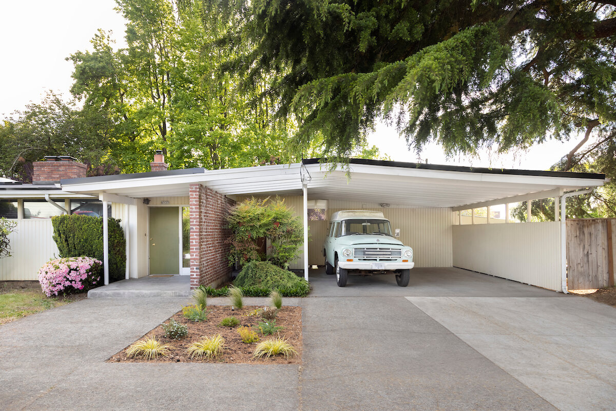
Before & After: A Design Duo Give Themselves Free Rein to Experiment With Their Portland Bungalow
WRITTEN BY: MELISSA DALTON
Lara White and Jason Stamp of Workaday Design infuse their 1922 house with plenty of personality.
When Lara White and Jason Stamp were hunting for their first home in Portland, Oregon, they were looking for a project. The couple—both partners at Workaday Design, a collaborative architectural design and interiors studio—had met in high school and worked together in the wood shop in college, so they were up for the challenge of tackling a renovation themselves.
The perfect canvas presented itself in the form of a 1922 bungalow that had gone relatively untouched in recent years. "One key thing was that it hadn’t been upgraded super recently," says Jason, "so there were no terrible updates that we were going to have to live out and redo." After purchasing the residence in 2012, they tackled the remodel in phases, first addressing the first-floor living spaces. Later, they added a low-lying addition to comfortably expand the main suite upstairs, making room for a bathroom and dedicated office.
It was also a learning endeavor since Jason and Lara executed much of the work themselves. In addition to cutting down and planing all that cedar for the exterior, on the interior, they refinished the floors, tiled the kitchen backsplash and en suite shower, installed the sleek bank of kitchen cabinets under the stairs, and built many furniture pieces. "We learned not to do drywall," jokes Lara.
The result is a home that chronicles the couple’s design thinking over the years. From the floating media console in the living room that Jason built—which doubles as the cat’s favorite nap nook—to the striking, curved mirror in the upstairs en suite that Lara devised after playing around with various shapes, it’s a custom home in the most personal way. "When you get to do your own project, there's nothing quite like it," says Lara. "You’re really just exploring."

dwell+
TWIN GABLE ROOFS FORM THE ULTIMATE SURF SHACK - ON A LAKE IN MONTANA
WRITTEN BY: MELISSA DALTON
At Whitefish Lake, Workaday Design conquers a tricky lot to capitalize on views of the water across the street.
In 2018, Lauren and Brittan Ellingson, the owners of Notice Snowboards, a custom snowboard and wakesurf company in Whitefish, Montana, approached Workaday Design and builder Mindful Designs to concoct a new lake home for their family. The brief was, perhaps unsurprisingly, focused on getting the family outdoors as much as possible.
The site had a fitting provenance for this purpose—the land once belonged to a summer camp, and the Ellingsons’ lot hosted the administrative office. "It was an old building, and it started to have some mold issues," says Zach George, designer and partner at Workaday Design. "So, they demoed the building and we did this building in its place—but we tried to keep that inspiration and the gabled camp feel of the original structures."
From the beginning, the couple wanted the new home to serve as their primary residence, with an independent studio over the garage. The lot has a tricky, triangular shape—it’s bound on two sides by roadways and has tree-filtered sight lines to Whitefish Lake across the street—so the design team "angled the home as much as possible to have views toward the lake, and to create a bigger backyard area," says George.
An open-air breezeway at the center of the residence connects the main house to the garage/studio unit. In the breezeway, an outdoor room facilitates connection between the separate living quarters. A custom slat screen, stained black, syncs with the front porches, and maintains privacy from the street. Operable doors in the screen allow for easy flow from the home to the lake.
The same slatted screen can be found on the entire rear facade of the garage and upper studio unit. Behind the screen, a staircase connects the studio to the ground level. White brick accents on the fireplace and at the angled front wall further punctuate the palette.
Now, thanks to their new digs, the family has the ideal setting for trying out new wakesurf designs. "Brit makes a lot of custom orders where each one is unique," says George. "But he gets to go out there and test those products. That’s definitely a cool setup."

Go Local magazine - Fall/winter 2020
RE-IMAGINING MONTANA LIVING
WRITTEN BY: ANNA RICHARDE
When most people think of Montana architecture, a heavily timbered mountain lodge is often the first thing that comes to mind.
“Having grown up here, I have often wondered if a traditional, rustic aesthetic needs to represent what architecture in Montana is all about,” says Workaday Design partner Zach George. “I feel like folks should be able to build in a way that makes them happy to live in their built environment, but I think it can sometimes play out as an old-west theme park view of what it is actually like to live in the Flathead.”
Instead of succumbing to stereotype, Workaday reimagines the hallmarks of Montana homes — stunning natural materials, expansive-feeling interiors, a focus on natural surroundings — while incorporating local craft and a modern aesthetic. The architectural design and interior firm seeks to create good design that is meaningful, innovative and timeless. They work on projects large and small, from new residential builds or remodels to commercial interiors.
The most eye-catching local example of Workaday’s design is the new “Twin Peaks” home recently completed in Whitefish. The name refers to the building’s silhouette, which features two cedar-clad “living volumes,” two-story gables flanking a single-story indoor-outdoor main gathering space. Each gable has a lake-facing recessed deck, prime spots to take in the views of Whitefish Lake. The designers created a striking effect by using charred cedar to create the decks’ dark lining, an effect also mirrored on the back side of one gable with a gorgeous charred cedar screen wall. The entryway, an alcove clad in white brick, matches the angle of the street.
General contractor Mindful Designs and Lauren Ellingson, who outfitted the interiors, collaborated to bring Workaday’s design to life. “Lauren did an amazing job really honing in on the specific material finishes, dialing in all the furniture choices, and really making the interior of the home reflect the language of the overall house,” says Zach. “Mindful Designs pulled together a team of highly skilled craftsmen to ensure a really quality home came together. Pulling off the detailing in a modern home can be tricky, and they brought a lot of knowledge and expertise to the table in that conversation. They used their knowledge of building science to put together a tight little home that lives bigger than it is.”
Zach says, “This home is exciting for us at Workaday because it breaks away from a traditional architectural stereotype of the rustic lodge home that is so pervasive in the Flathead Valley. It’s refreshing to see a home that is more clean and honest in its massing and material choices, celebrating the workmanship of the craftsmen in tight, clean details that take a lot of time to get just right.”
As even a quick drive through the valley can tell you, new construction is taking off in the Flathead. In addition to the influx of people moving to the area, many locals are seeking to improve their existing houses, having recently found themselves spending more time working from home and venturing out in public less.
“More people are starting to think about the quality of space in their home, as opposed to the quantity,” Zach explains. “Clients seem to be placing more of a premium on their work-from-home capabilities when considering their living arrangements. This seems to manifest itself in a solid connection to the outdoors and clean, well-thought-out interior spaces.”
In regard to the rapid growth happening in the Flathead, Workaday Design believes architecture is very important in channeling positive, smart growth in the area. “I think architecture and urban planning can play a huge role in the Flathead Valley’s future as we begin to consider why it is that we all enjoy living here,” Zach says. “I believe part of the draw for people of all different viewpoints is the large open spaces and accessibility to the outdoors. There’s only a certain amount of land in between the surrounding mountains on our valley floor, and making sure that we leave room for the agricultural and recreational landscape between pockets of developed land seems to be a vital issue. I don’t think anyone here is particularly interested in living in a sea of one-acre fenced-off residential lots. Making sure we create a valley that has a variety of densities, scales, and walkable mixed-programatic uses in between the spaces that we all cherish should be at the forefront of the conversation.”